
Hey Guys!
Today I’m doing another Cover Wars post, featuring the book I just finished reading, Second Chance Summer by Morgan Matson. This book was so sweet, but also extremely sad. I’m sure if your in the book community you’ve heard of it before, because Morgan Matson is a really popular author. I ultimately gave the book four out of five stars.
Let’s get started!
English

I like this cover, but I wish it matched Morgan’s other book covers. TUE & SYBG have book covers that sort of match with the fonts and pictures, and I really like it when an authors books match like that. This cover shows that the book is very sad. 8/10
English (Republished)

This is my favorite cover because it actually does match the other books! My only complaint is that I don’t understand why Taylor is wearing a skeleton shirt. The book cover looks all summer-y and cute, and then you see the emo shirt, lol. 9/10
UK

This is the only book cover that doesn’t include a dock, lol. I don’t really like how jumbled everything is. 5/10
German

Okay, this cover weirds me out a little bit. LOOK AT THEIR ARMS! I know they’re supposed to be hugging but it looks all weird and disjointed to me. Also, who wears jeans in the summer?! 2/10
Czech

This looks like a cover that I could make on an editing app on my phone. I don’t like it. 1/10
Dutch
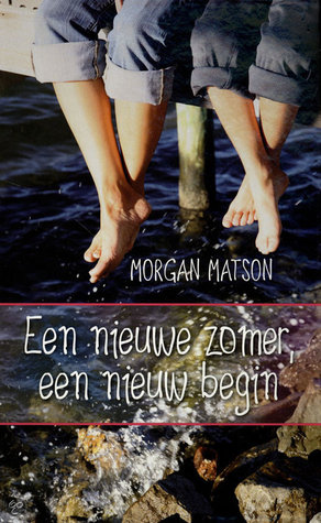
I don’t like this cover at all. 1/10
Polish

This is my favorite of the forign covers. I agree with the font choices, but the rest of it I really like. If you got rid of the font that says Second Chance Summer I would like this a lot more. 7/10
VOTE BELOW FOR YOUR FAVORITE!
Let me know what you voted for in the comments! My personal favorite is the republished English cover!
xx,
Sophie

My favorite is English (Republished). It felt like it match better with her books. The feel of summer, which she’s well-known for doing. The fonts itself is fun, not too serious, which is needed since it has teenagers. They can be serious but most of the time, they’re fun, want to have fun, with family and with friends.
LikeLiked by 1 person
Yeah I agree!
LikeLiked by 1 person
My favorite is the English one. I have not read the book, but it evokes a somewhat sad tone, while still making me want to read the book…kind of a “summer is ending, school is starting soon” kind of feeling, but it makes me want to find out what the book is about.
LikeLiked by 1 person
Yes, I think that definitely represents the book. It’s very sad 😦
LikeLiked by 1 person
I didn’t realize there was so many different edition😦
LikeLiked by 1 person
I know! I always find it really interesting to see all the different international editions.
LikeLike
And I like the English one because of the colors😁
LikeLiked by 1 person
Yeah it’s so pretty!
LikeLike